![Zetharis [Dev page. Unstable.]](https://img.itch.zone/aW1nLzM3NTQ2NzUucG5n/original/68PbGv.png)
Zetharis [Dev page. Unstable.]
UI Changes
Heya otherworlders,
Just dumping a few thoughts here. And well, i could use some opinions on this.
I am sure those of you who follow this project will probably agree, that the world overall is quiet a bit boring right now and kind of lame to explore. Not to mention, with the way the world UI is designed, majority of people end up looking into the tiny map window on the top right while probably ignoring the quest on the left... (and for a good reason, really. It's mostly procedural there overall.)
So with that being said, i've decided to rework the UI just a tiny bit to adress this issue.
Now the UI should be less cramped, and more comfortable to navigate.
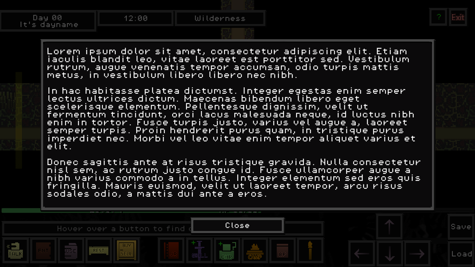
The not important text will be gone, and will be replaced with events, events being: the text that is important to location/story/quest, etc etc.
So instead of completely ignoring the useless information, you simply will not see the useless information, and would be more easily focused on what's going on without continuesly re-reading the same crap, or ignoring the same crap overall.
Example of the new UI:
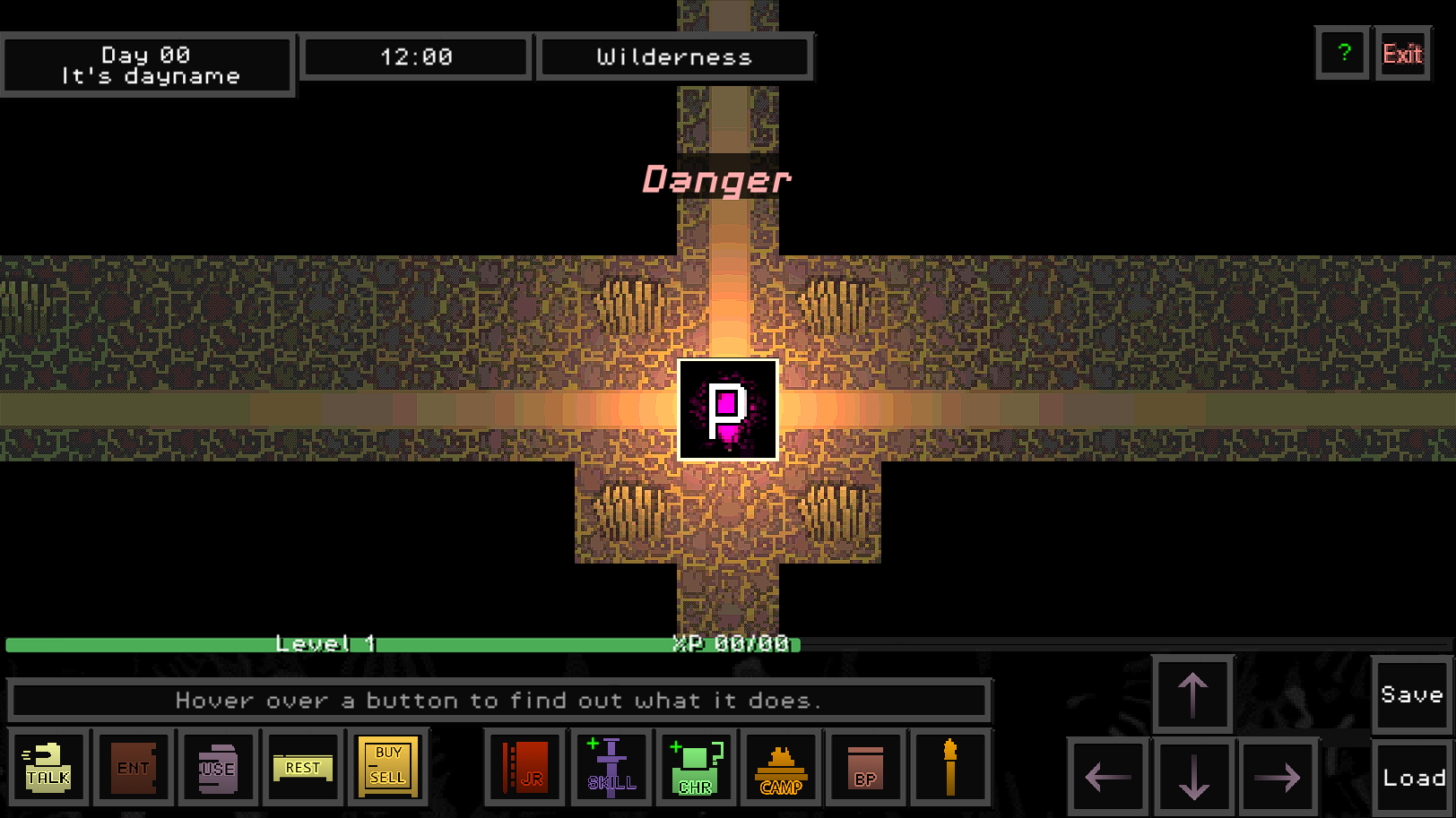
Either way, here's a tiny preview of the UI Changes. Please let me know what you think.
Example of important text showing up instead of generic repetetive crap:
Thanks in advance.
Leave a comment
Log in with itch.io to leave a comment.